Behind the Scenes
SoFresh

Fresh take on SoFresh
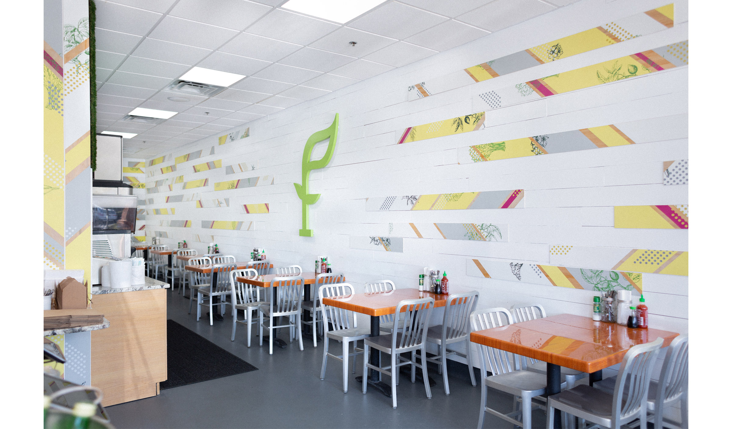
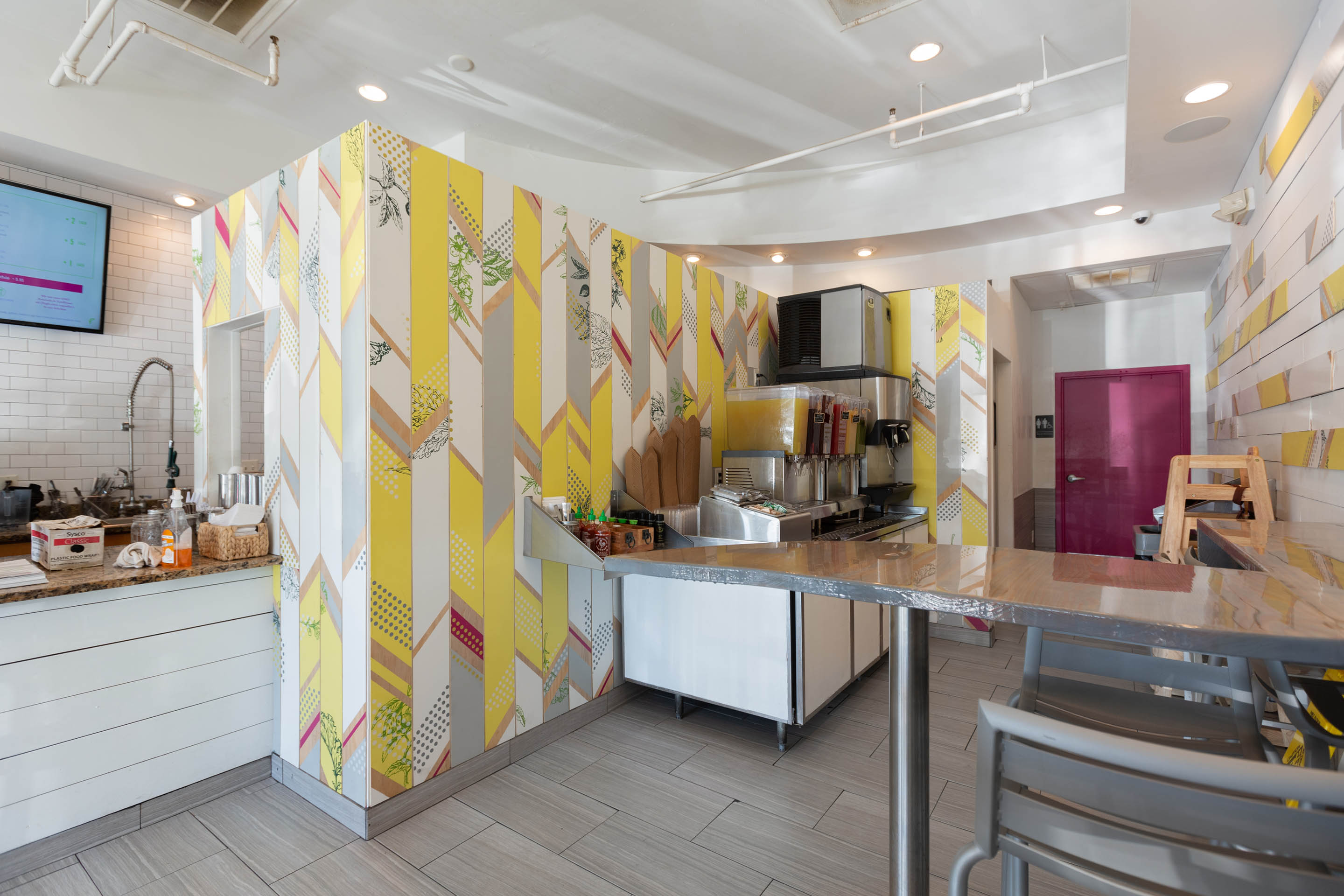
As we worked with SoFresh to update their dark wood interior, we wanted to convey the brand’s vibrant, healthy aesthetic. We drew on the SoFresh brand colors of fuschia, green, and white to cover the interior walls and bring life to the space through color, while imagery of kale, almond and quinoa plants ties in the life-giving ingredients SoFresh serves in each menu item.


Cohesive concept
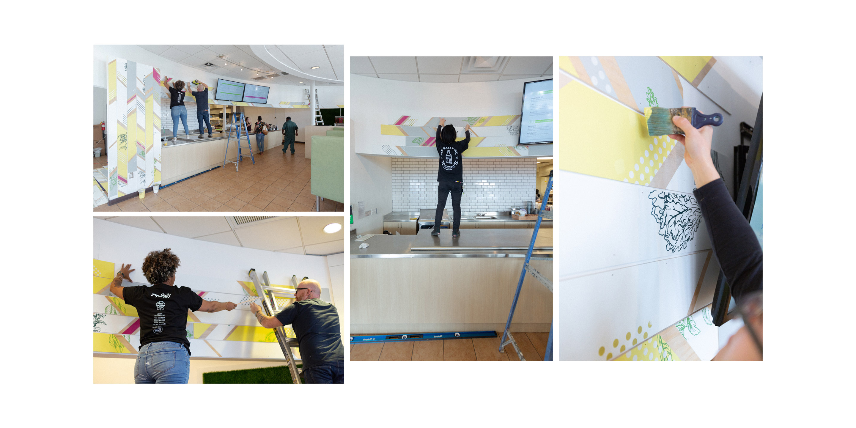
To create a unique installation of the brand’s colors and products, we created a zig zag pattern for a presentation that brings energy to the space. Each mixed media wood panel is unique in its layout and mix of imagery and color.
With the new installations that marry branding with their spaces, SoFresh will be able to bring a unified style to each of their current locations and their new ones, as the brand expands outside its home city of Tampa. In this way, each store can have a varied approach to a cohesive interior concept.

