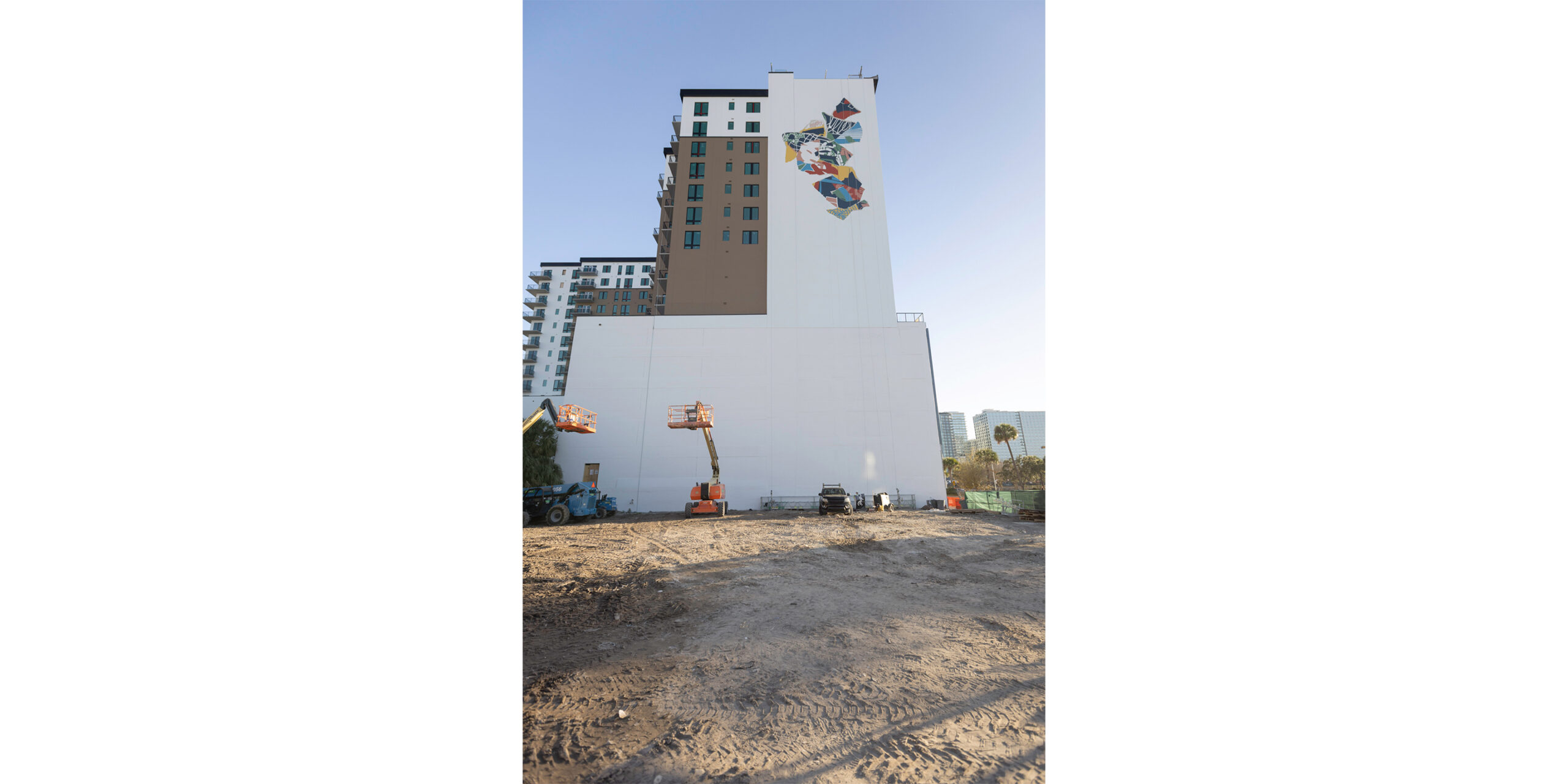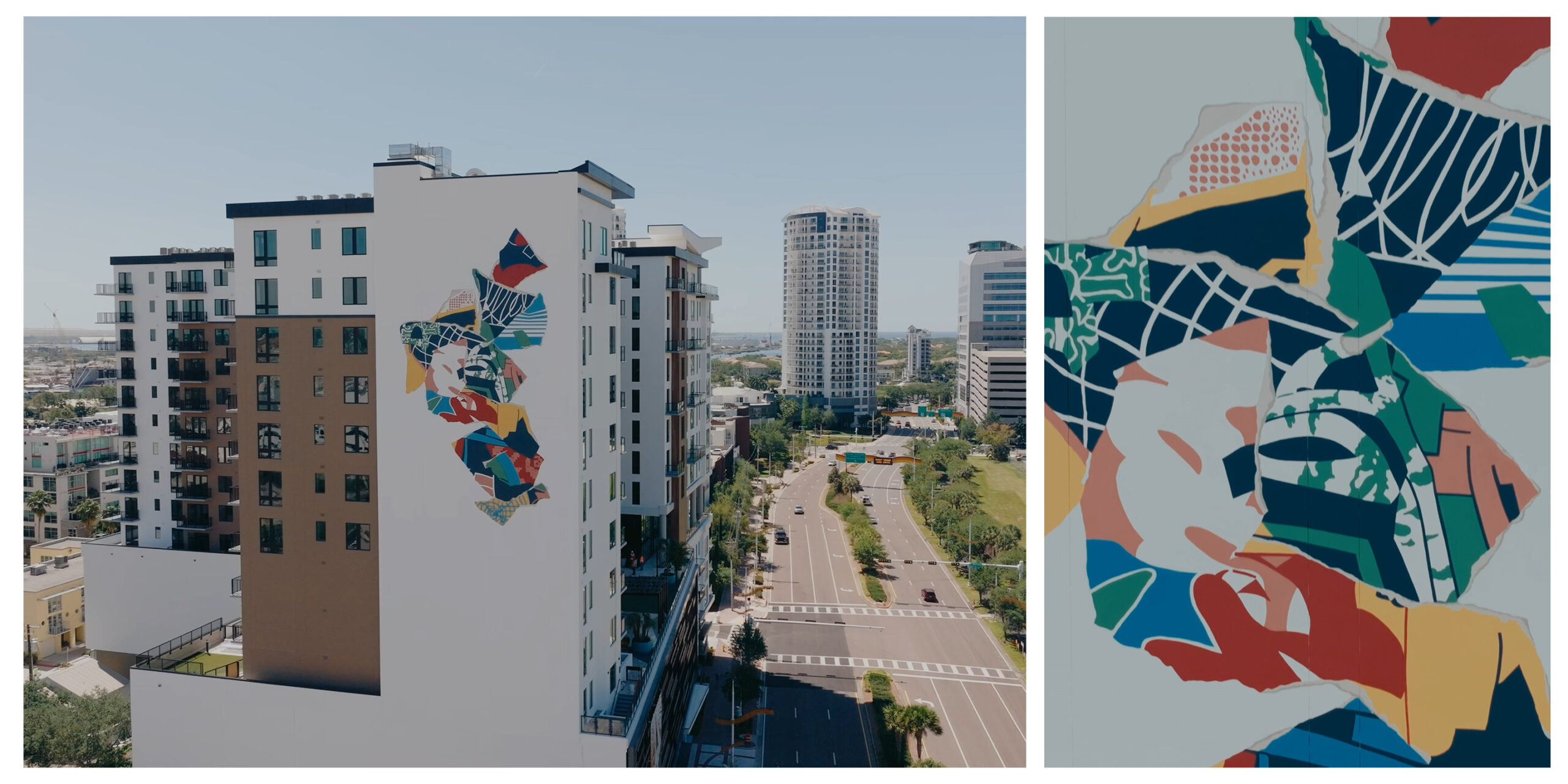
It’s no secret that Tampa is one of the fastest-growing cities in the country. With this rapid expansion comes a need to distinguish each new addition to the skyline. A large-scale mural is a perfect way to bring a wall to life, but what if that wall is 17 stories tall? Before we even began discussing design concepts, we had to solve the logistics of accessing such a massive wall.
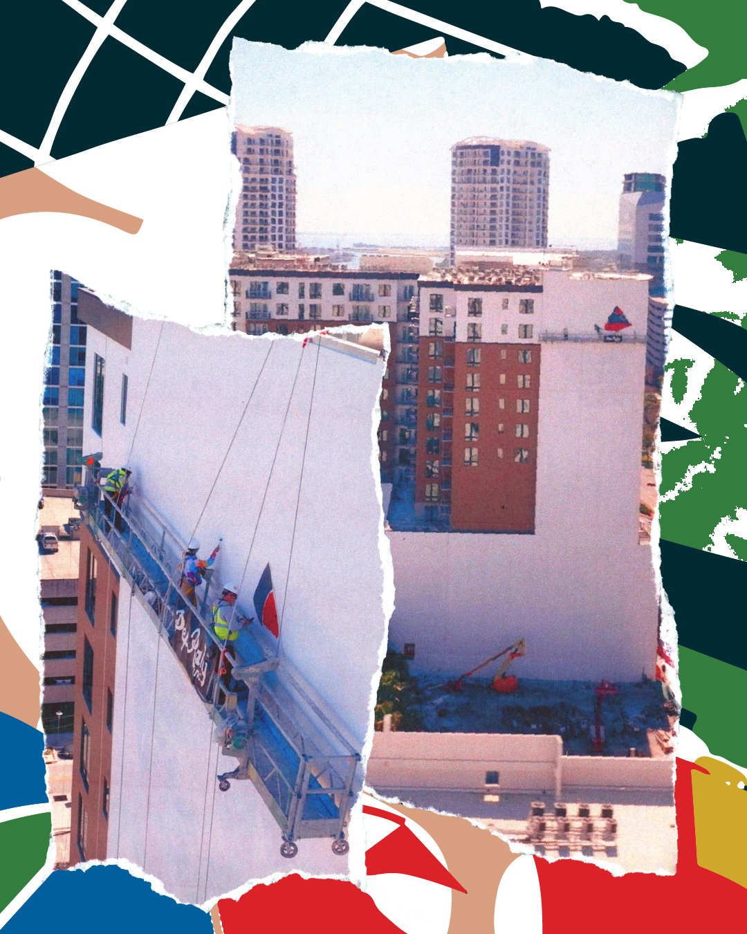
In the 10 years that Pep Rally has been creating public art, we’ve used every type of access equipment, from scaffolding to boom lifts. However, for this wall, the only solution was a swing stage. While we have experience with swing stages, not at this scale, and many muralists refuse to use them altogether. The first step was getting our entire team OSHA certified to operate the equipment.
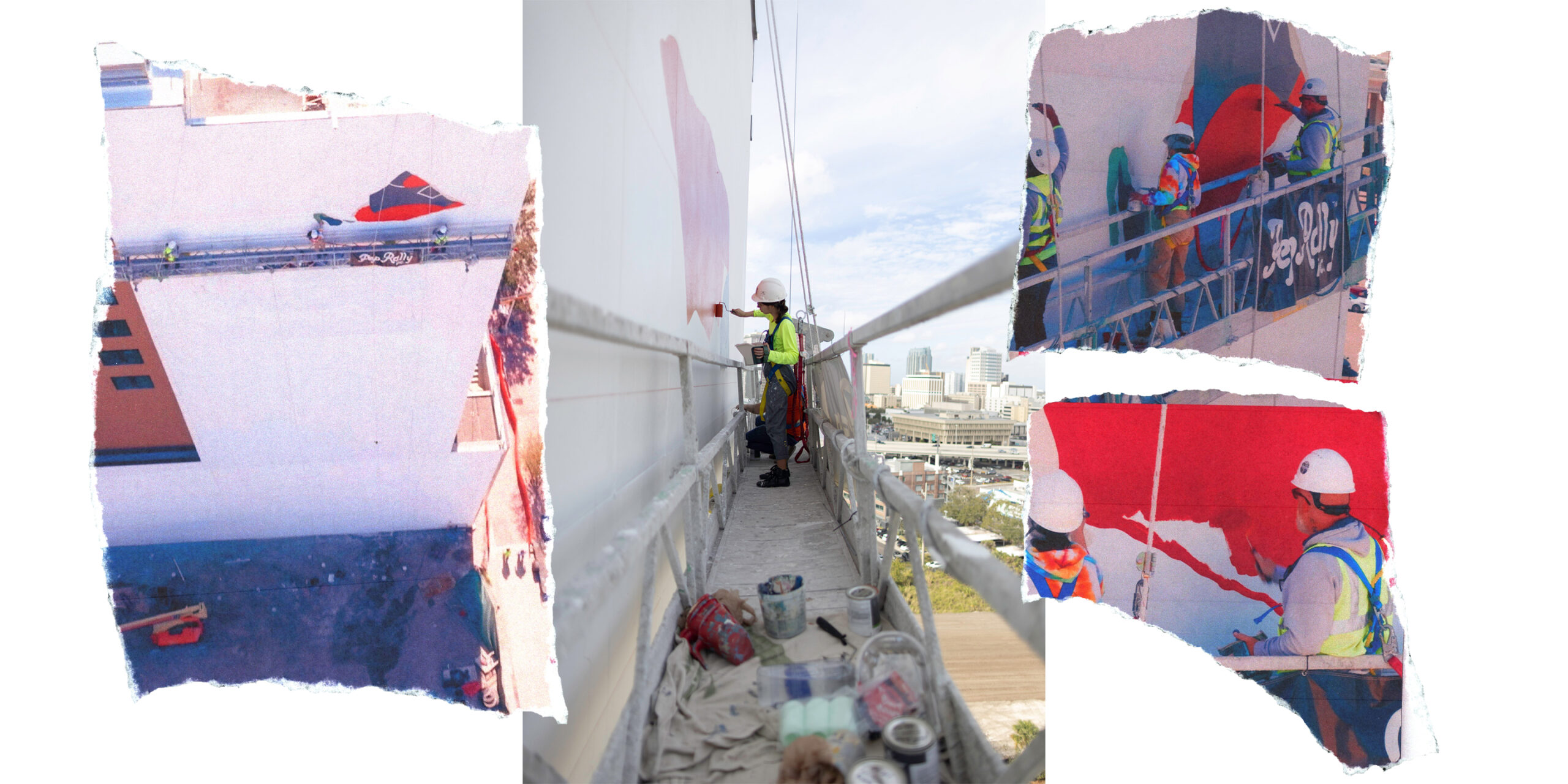
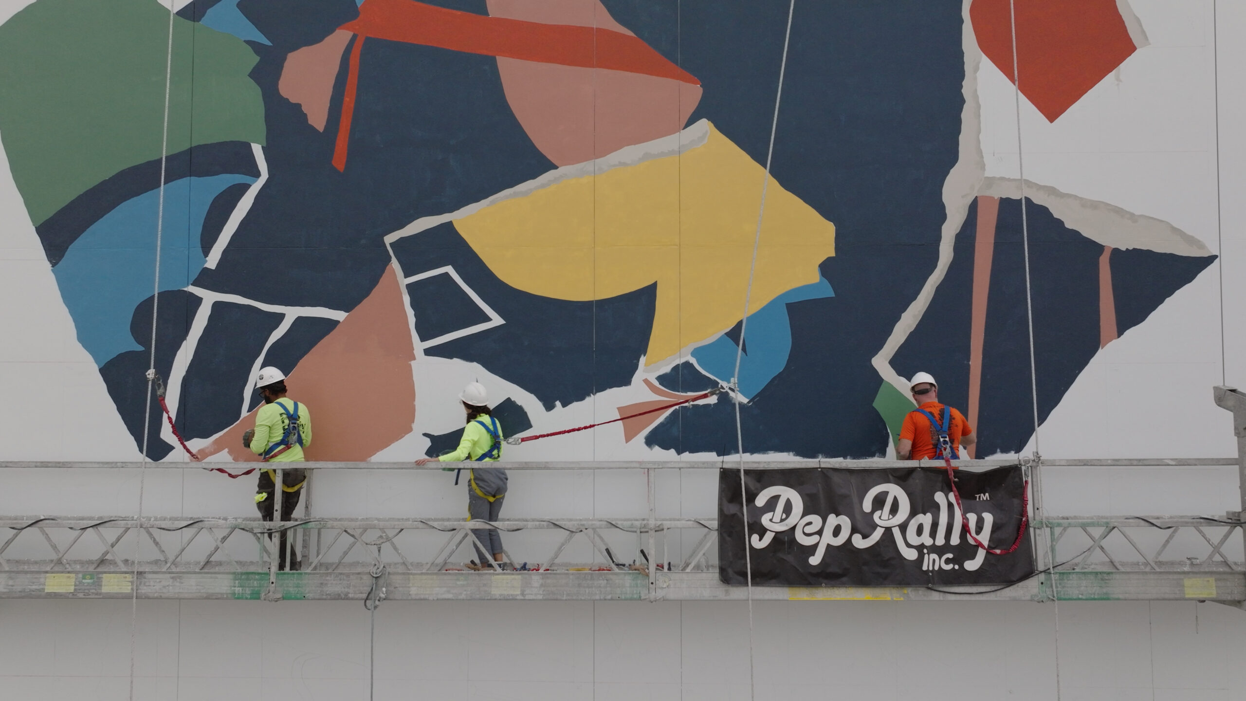
Next, we had to figure out how to accurately lay out a design on a wall the size of a football field. If the wall had been closer to the ground, we would’ve used digital projectors to create the outline, but that wasn’t an option here. We relied on the tried-and-true grid method: a one-inch square grid on our printed design translated to a three-foot grid on the wall, with six-foot levels and chalk lines. Lastly, we had to account for the fact that this mural would be visible from hundreds of yards away, from cars on the Crosstown Expressway to pedestrians walking their dogs on the path 100 feet below.
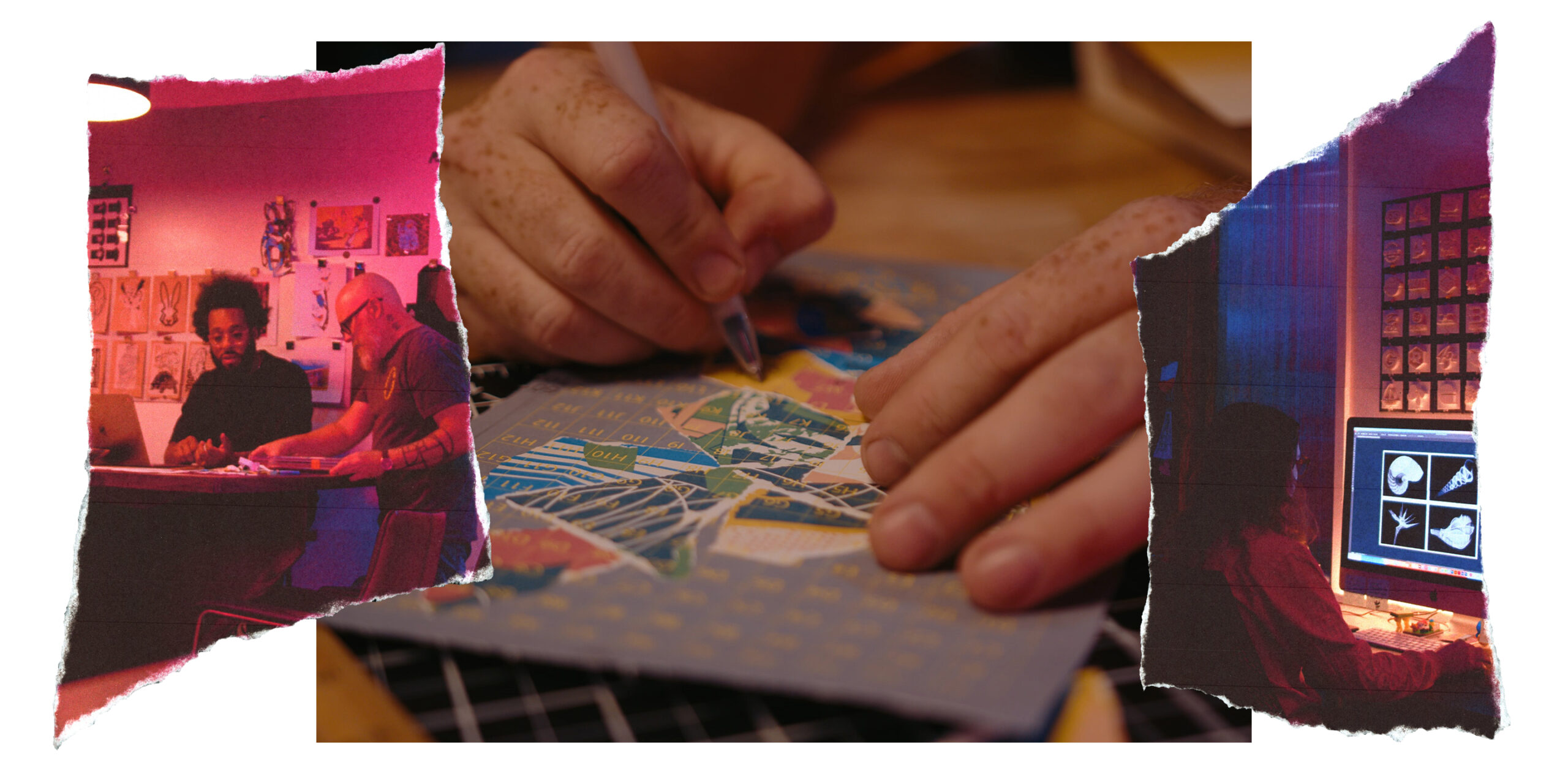
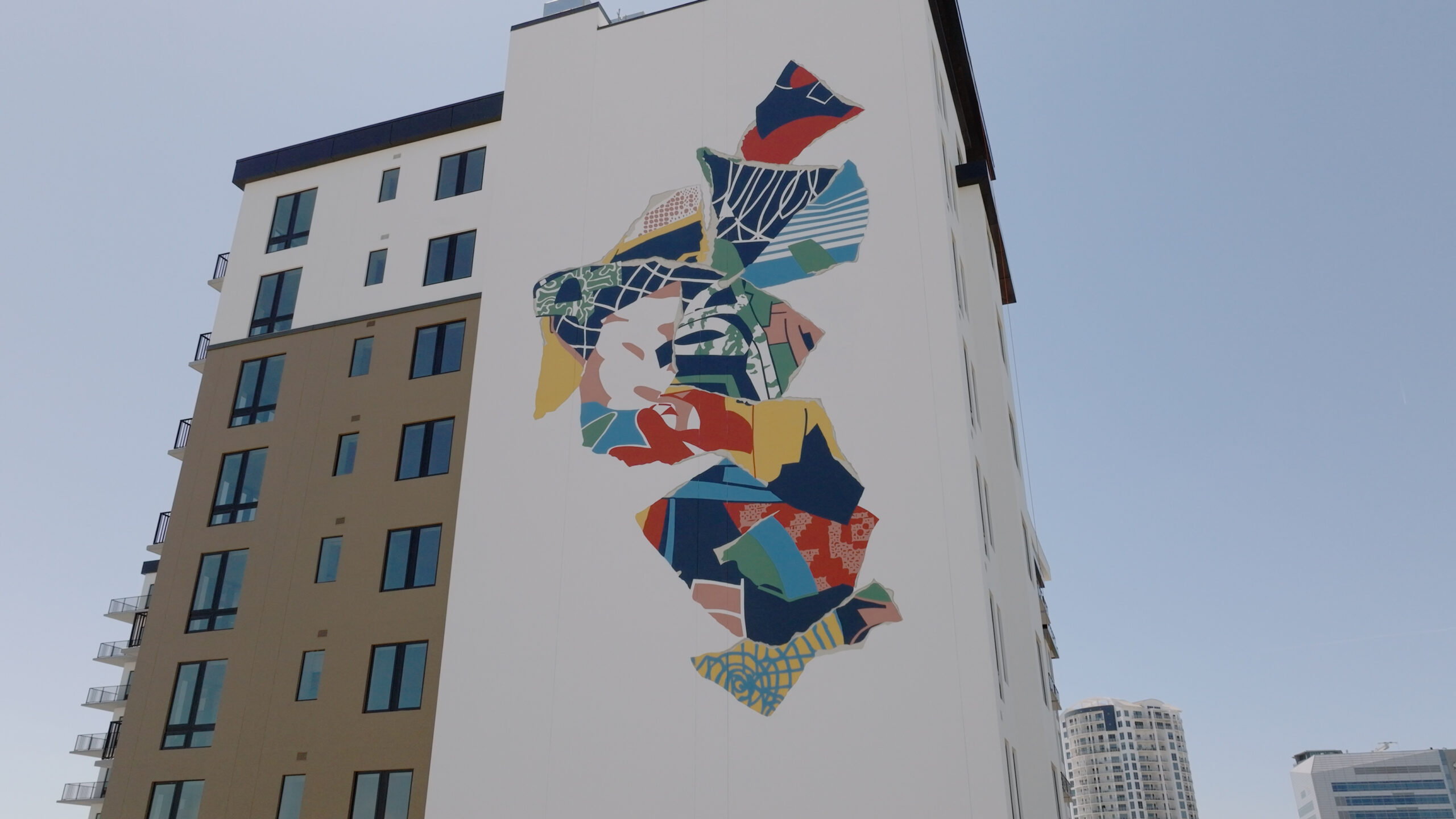
Once we had the logistics down, we shifted our focus to the design itself. As a studio, our aesthetic leans toward minimalism. We love telling complex stories using bold colors and simple shapes, pushing to create compositions that stand the test of time. During our initial design sessions, we explored one of our signature techniques—creating multiple patterns and images, only to deconstruct and reconstruct them into new compositions.
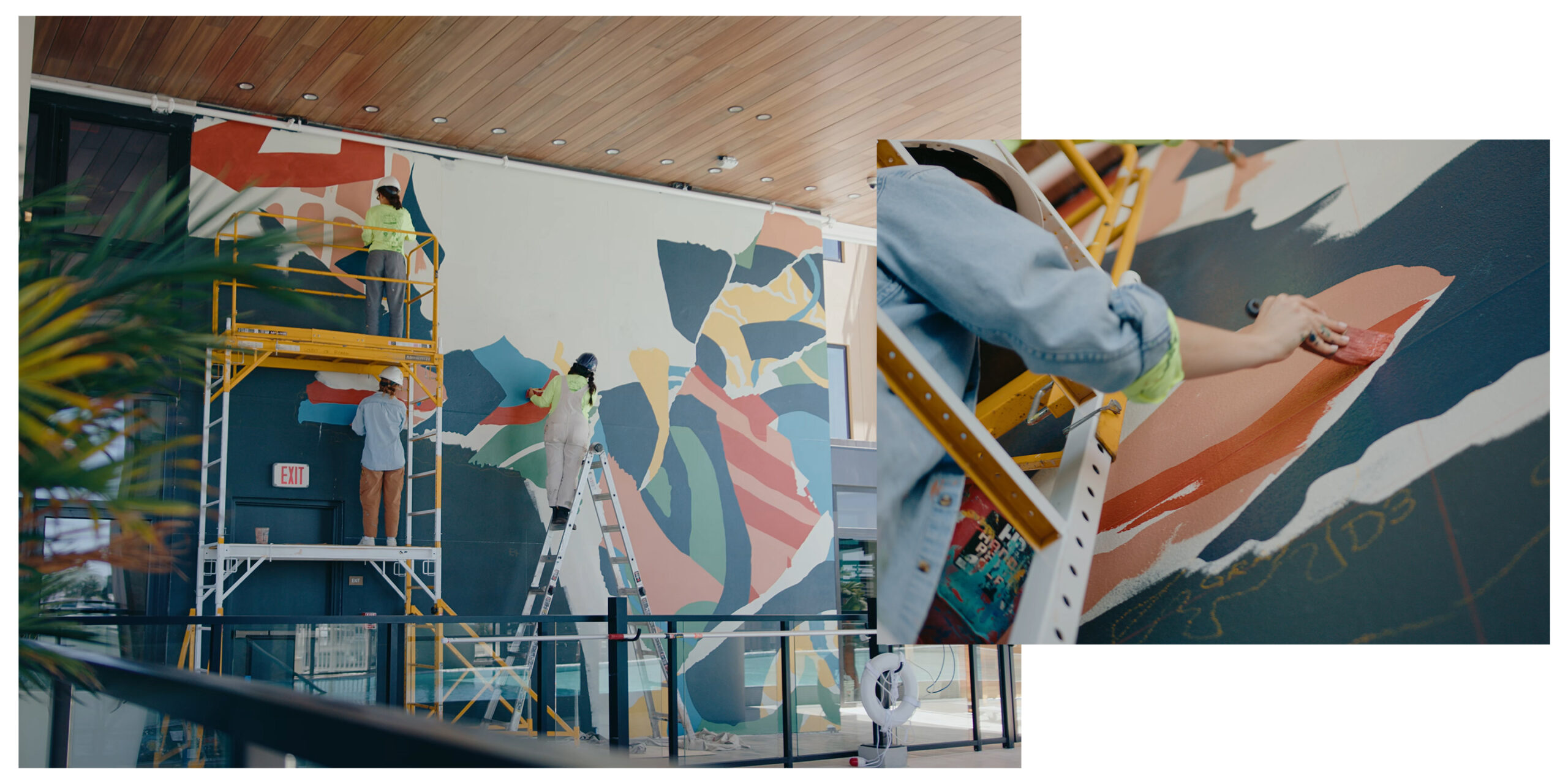
For this project, we used nautical symbols and colors to celebrate Tampa’s port. Eventually, we tore one of the paper patterns into triangular shapes, reminiscent of Davis and Harbor Island, which instantly became the foundation of the design. The triangular pieces created a dynamic shape, with light casting shadows under the fringed edges. We leaned so heavily into this approach that cropping the edges to fit the rectangular building felt like it would detract from the feel we wanted. The composition became sculptural, so we decided it needed breathing room on all sides to give it the prominence it deserved.