Brand identity development is an important step in creating a strong, cohesive visual reference for your audience to recognize.
Creating an icon
Creating an icon that will represent a business or complex idea is a matter of context.
Visual identity requires a system built of symbols, colors, patterns, typography, negative space and illustrations, which are all important aspects that tell a part of the story.
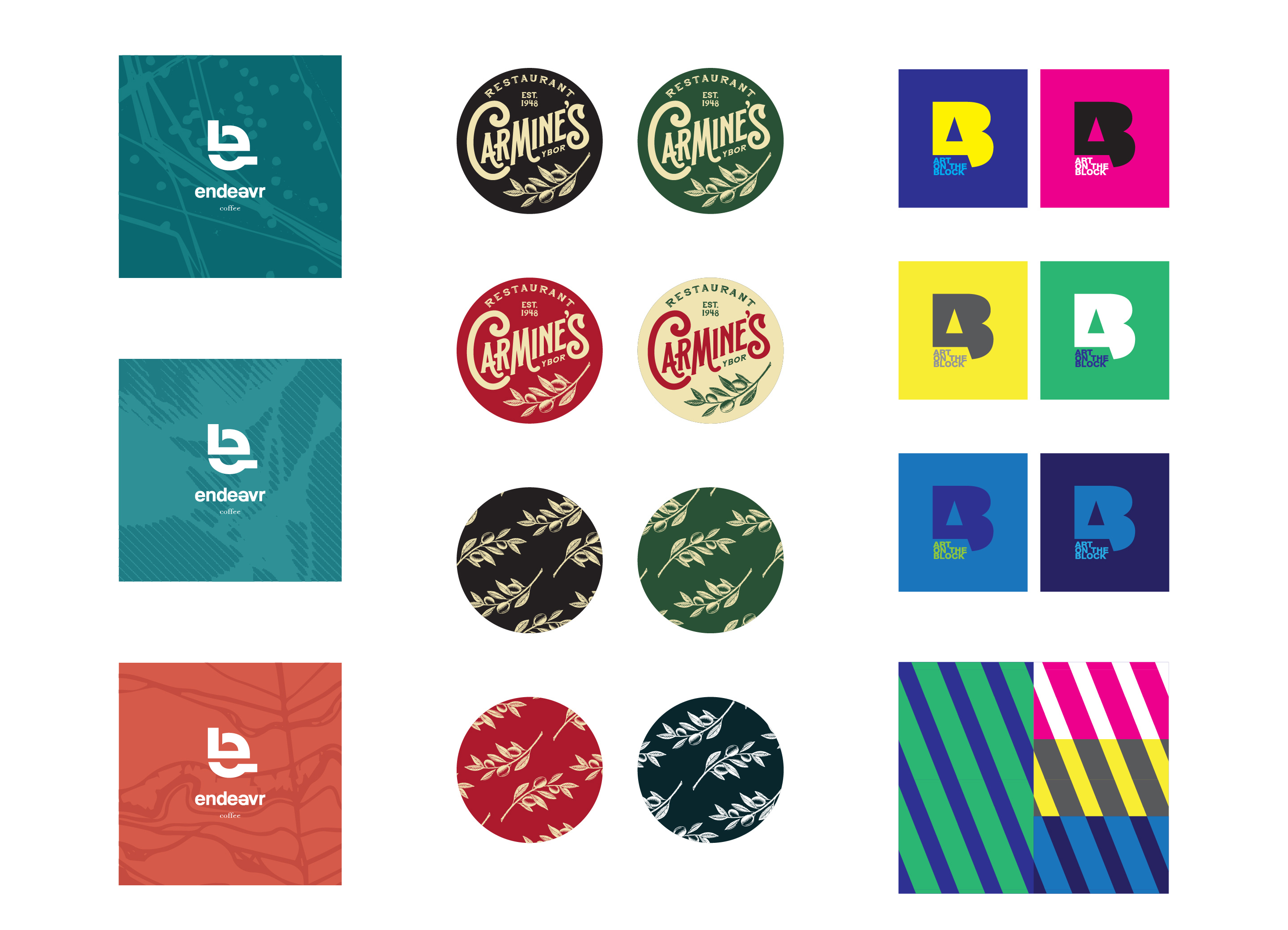
Primary logo / primary mark
A primary mark, or logo, is the main graphic that represents your business. A great mark is clear and concise and is legible when produced as small as a business card or as large as a billboard.
Logo clear space
In order for visual information to be understood it needs to have proper breathing room. Any visual information that gets too close to the identity system can confuse the whole story.
Wordmark + logo variations + typography
Each part of the visual identity is a tool that can create cohesion and context.
A wordmark is very similar to a logo. The major difference is that a wordmark is typography only. Wordmarks are the exact opposite of brandmarks and should be treated like logos.
Defining what typography to use that will compliment a logo is important in overall branding. The chosen typeface needs to complement the graphic without overpowering it.
Pattern
Pattern is the most versatile of the identity tools. It is a vital component because it can be used as a passive connector or bold statement piece.
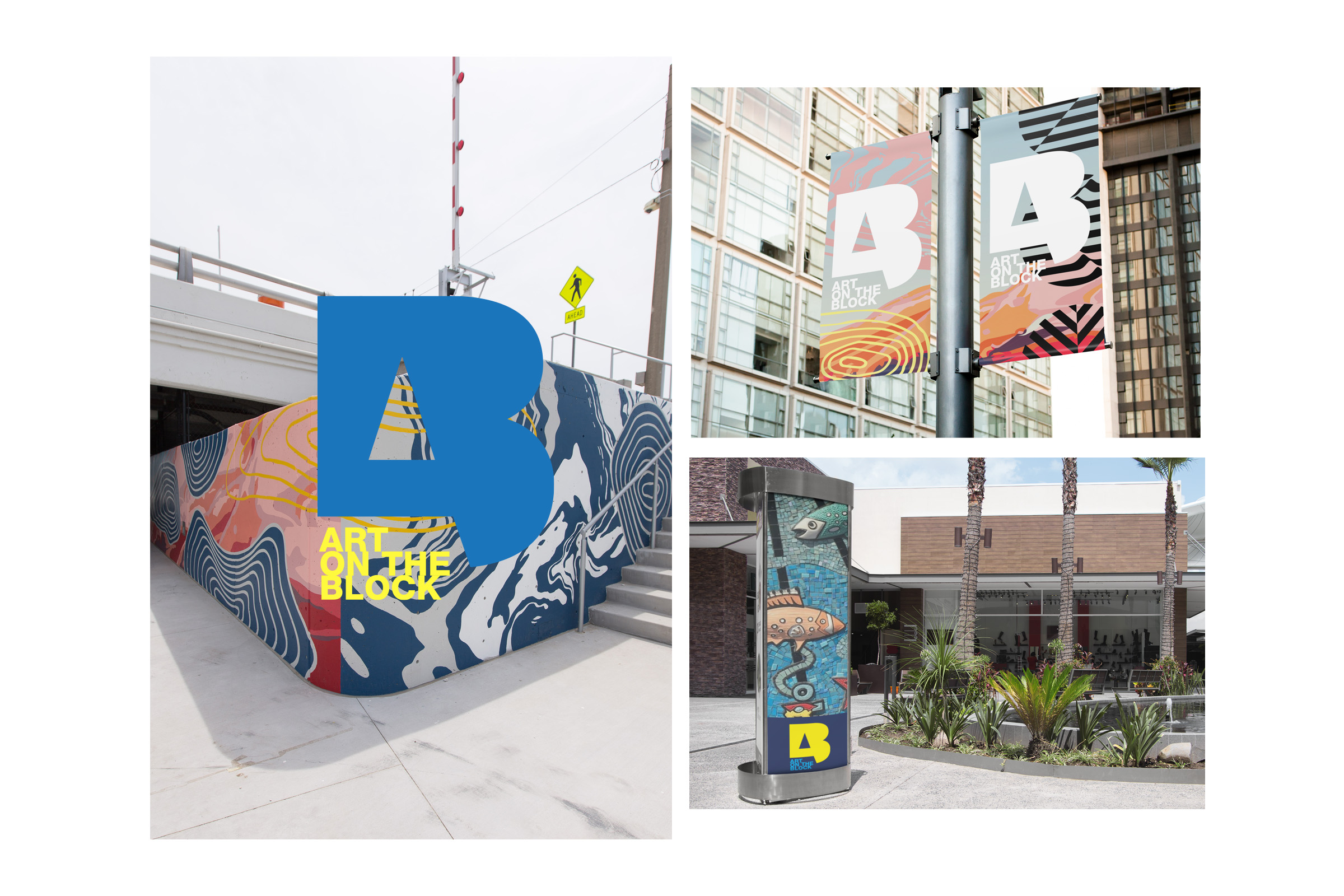
Application
Considering every environment a brand will be visually represented can be the biggest challenge of identity design. Legibility is key, from the smallest digital icon or profile image to larger signage, billboards, or vehicle wraps. Every identity image will exist in a variety of formats, presentations, and locations. Because application will vary wildly, creating a story that is both dynamic and clear is a multifaceted puzzle that we love to solve.