Tampa Bay Lighting murals further team’s presence
Client
Tampa Bay Lightning
What
Mural and Mixed Media
Location
Various locations

It is time to lift up the cup!
2020 was a polarizing year. New obstacles arrived each passing month. We were forced to look internally, to rethink every aspect of our lives. A stark year that uprooted norms but sparked a opportunity for reinvention. What started as bleak ended with a championship. Adjustments were made, inner strength was found and victory was obtained. It is time to recognize the struggle. It is time to acknowledge the raw fight. It is time to lift up the cup!

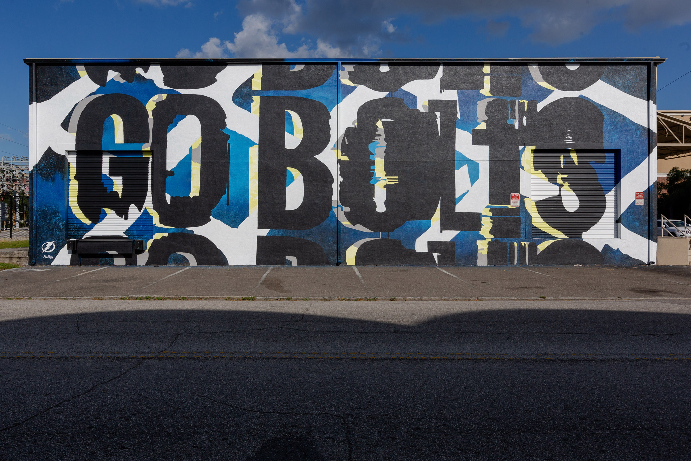
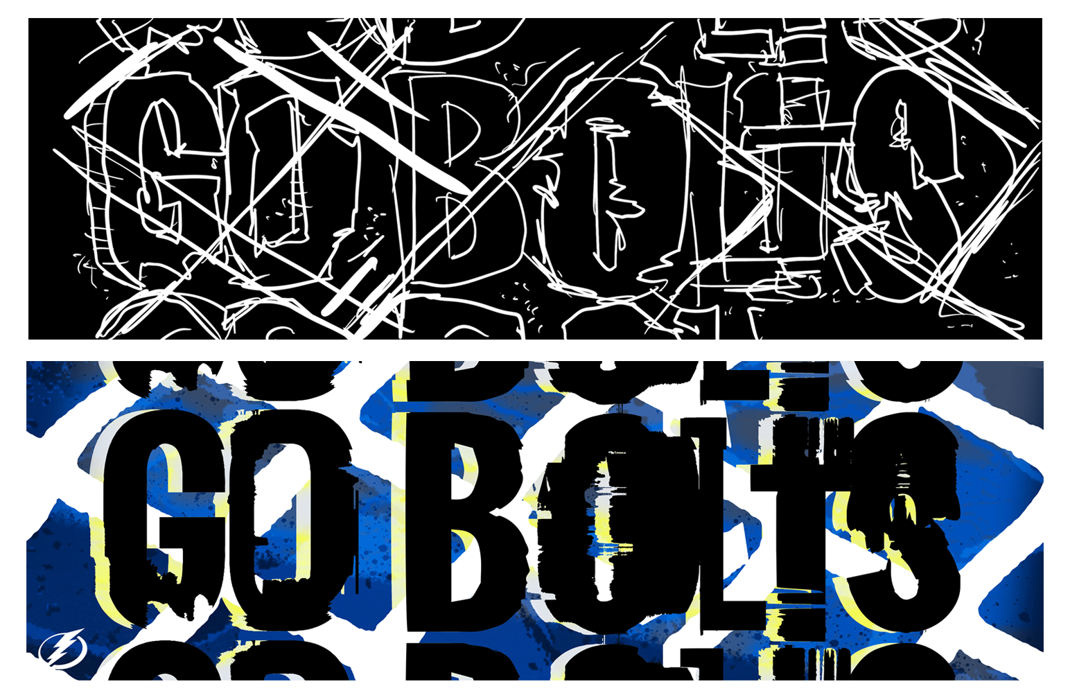
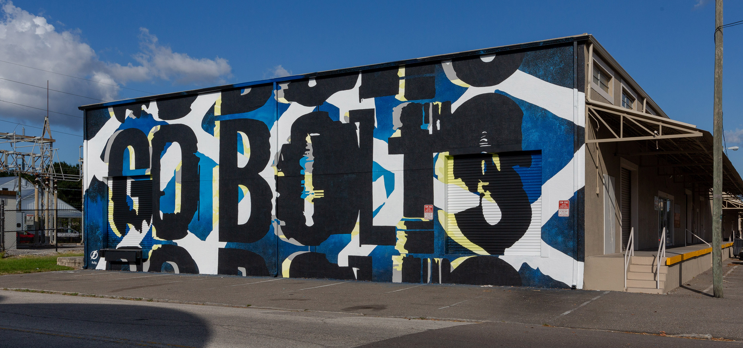
Electric energy conveyed in two dimensions
For this work, we created imagery that would convey movement and make observers feel as though it is vibrating with energy. We used elements like stacked text and visual representations of static to evoke the proximity of the energy when lightning strikes.
Intense elements tie imagery to reality
Yellow tones accent the cool team colors and act as a foil to bring the “GO BOLTS” mantra to life. Bold imagery contrasts with textural elements of hockey goal nets and ice, while storm clouds and real lightening imagery marry the intensity of the rink with the intensity of an afternoon storm in lightning alley.
These elements unite to celebrate the Tampa Bay Lightning and the intense flash we often experience following the rumble of thunder.

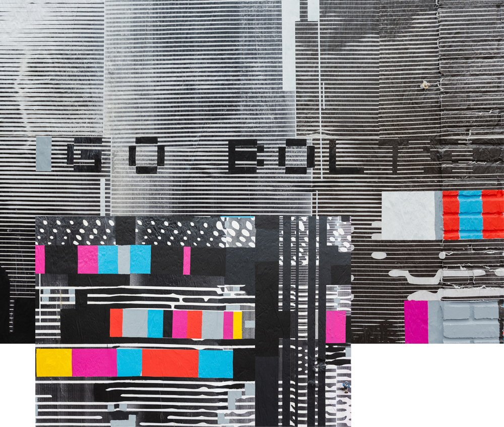
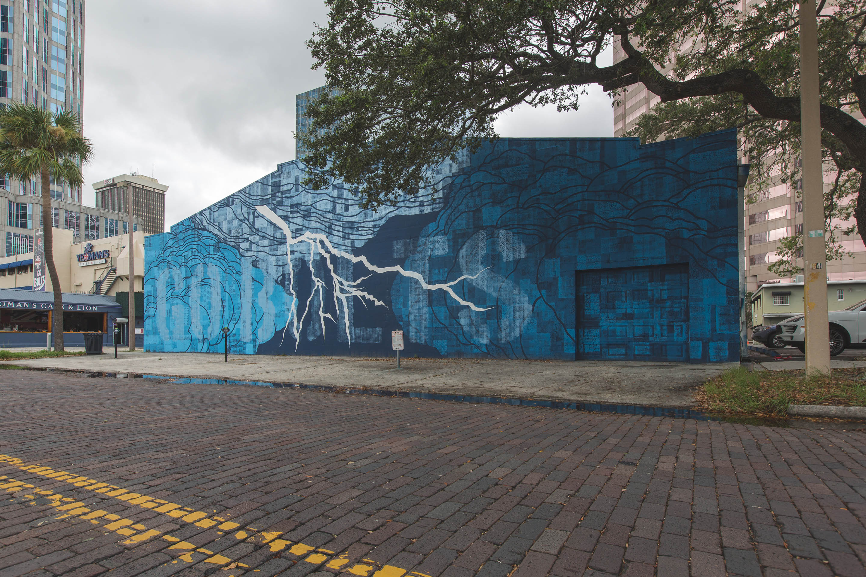
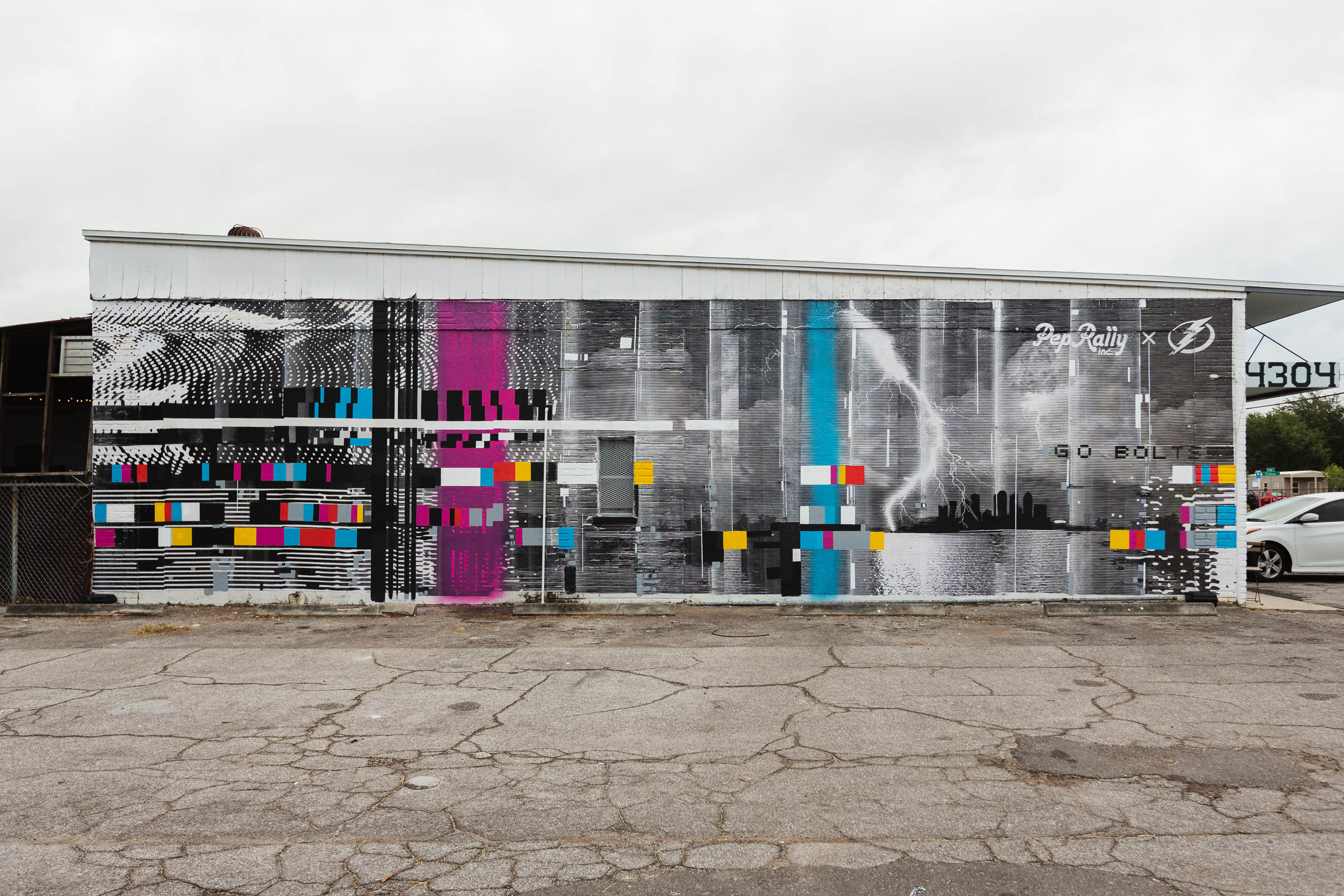
Electrical force disrupts frame
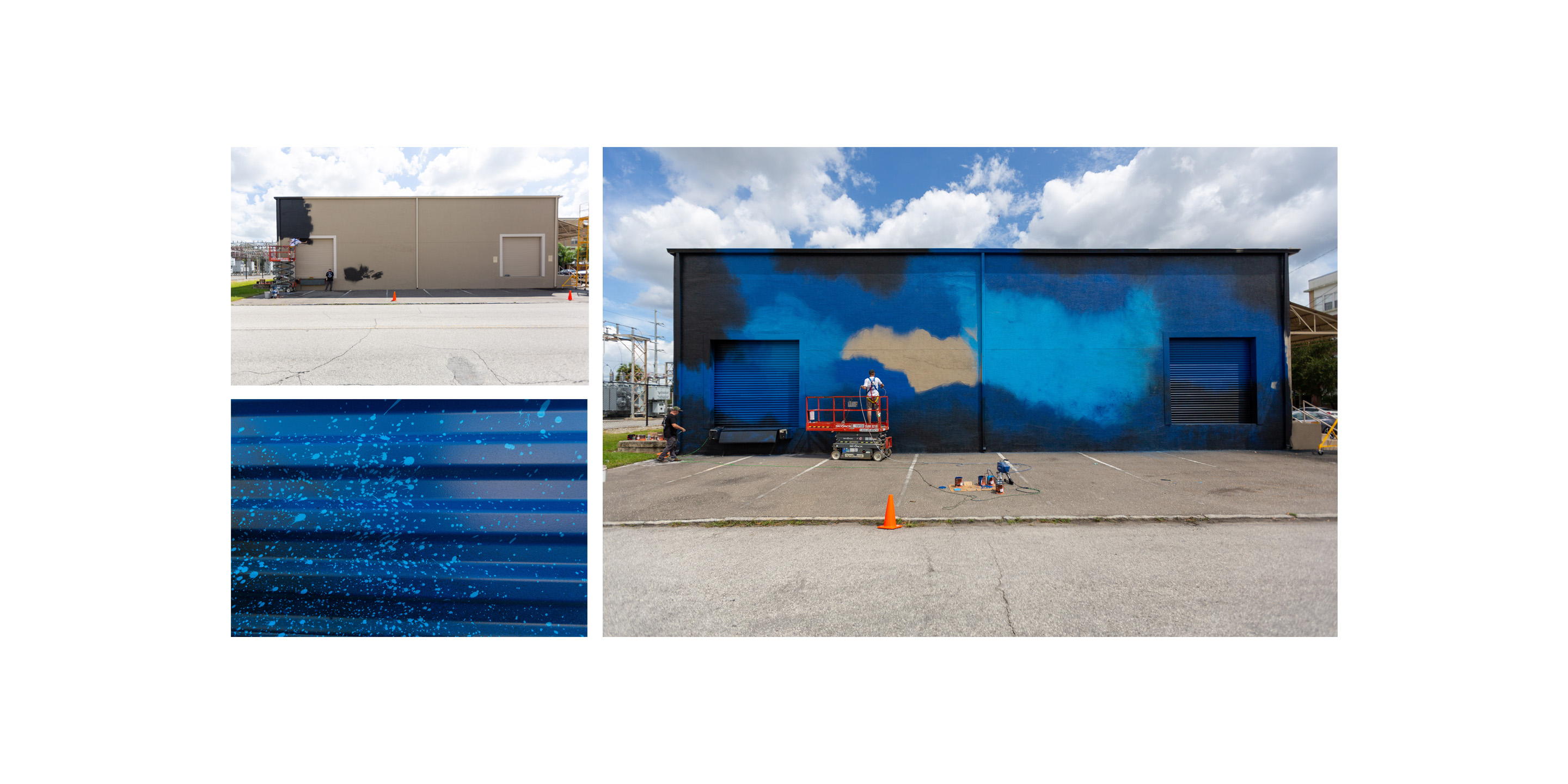
Our concept behind this mural was to show the force of electricity as a storm rolls into Tampa Bay. That energy is invisible but will disrupt your TV and make it “glitch,” and that is the moment we wanted to capture. To reinforce the concept, we created the background illustration of a storm over the Tampa skyline to look like the picture on an old black and white monitor. Hints of color create separations that complete the disrupted image.
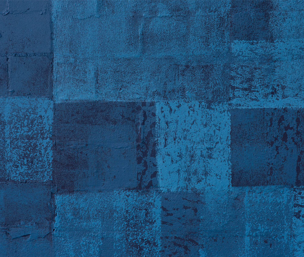
Multidimensional layering shifts focus
We created the deep blue shifting patterns that occur in storm clouds as they roll into the Bay using layered paint textures applied with uniquely textured sponge rollers. Overlayed “GO BOLTS” text, lightning, and clouds complete the visual narrative. To achieve the intentional subtlety of branding on this piece, we painted the letters in clear glossy finish over flat paint to make the message secondary to the artwork.